
Last Modified: 10/31/2025
Web Resource Guide: Design & Layout
The design and layout of a site is important for marketing, usability, and accessibility. A modern, user-friendly design encourages people to use and return to your site. Clear navigation assists users in locating specific webpages, while the organization of content allows audiences to scan a page and quickly find what they’re searching for. Images and graphics enhance the visual appeal of a website and can convey information to viewers. It is important to consider how people view your web pages, which web browsers are being used, and if information is accessible through screen readers.
Critical Design & Layout components of an EHDI website fall into the following main areas:
EHDI Administrators should work with website technicians to implement changes needed in the Design and Layout of their website. Criteria for website improvement in this section are not limited to this resource guide. The selected critical components are based on what EHDI administrators can easily evaluate. Information in this section involves technical detail that is needed in reviewing the criteria and communicating needed changes with the website technicians.
Organization
Layout and structure are critical components to ensure that audiences can quickly find the content they’re searching for. Layout deals with the location of information on the webpage, while structure involves the order in which the content is presented.
Layout
The layout of content plays a key role in the design and accessibility of a website. It takes into account the location of the prime space, navigating mechanisms, and content areas. Prime space is where the audience looks first, usually the top left corner of a webpage. This is due to our habit of reading left to right, unless our focus shifts to an area with an element (e.g. image or color) that stands out. Usability increases when it is clear how to navigate the website to find needed information. Generally, navigation menus are located around the content area because that is what audiences expect. Layout of the content area should be consistent across all pages. Examples of clean, easy-to-use layouts are provided below.
Visitors to a website access the information either visually or by using a screen reader. Both the visual design (created through the use of style sheets) and the order of information must be considered when organizing content on a webpage.
Documents shall be organized so they are readable without requiring an associated style sheet.
This means that when all styles are removed from the page, the content must remain in its intended order. This is critical for people who use screen readers or who navigate with disabled styles. By using standards-compliant HTML and CSS, information will remain in its intended order, regardless of whether styles are enabled or disabled. Meanwhile, sites that use table layouts for design are generally read from left to right (like spreadsheet cells) and content order can get mixed up.
Tech Notes: Disabling Style Sheets
EHDI administrators can verify that website content is ordered correctly when viewed without styles or read by a screen reader. After styles are disabled read the content like you would a book. This is the structure order that a screen reader will read the information. If a picture is shown the reader will read the alt text associated with the image.
Disabling Styles in browsers
- FireFox (Win and Mac): Via the menu toolbar, choose: "View" > "Page Style" > "No Style
- Safari (Mac): Via the menu toolbar, choose "Develop" > "Disable Styles"
- Opera (Win): Via the menu, choose "Page" > "Style" > "User Mode"
- Chrome (Win): Via the gear icon, choose the "CSS" tab > "Disable All Styles"
- Internet Explorer 8: Via the menu toolbar, choose "View" > "Style" > "No Style"
- Internet Explorer 7: via the IE Developer Toolbar menu: Disable > All CSS
- Internet Explorer 6: Via the Web Accessibility Toolbar, choose "CSS" > "Disable CSS"
- Option no longer available for Chrome or newer versions of Internet Explorer without addons.
Structure
Think of the web as an interactive book. You can click on the table of contents (navigation) to go straight to the chapter (section) you want. The question that remains is “How do I find what I am looking for?” There should be a consistent structure for the content whether it is all on one page or across several pages. Having a good structure benefits the organization of information and marketing of the site.
Information appears organized and is easy to find when it is broken up into sections. Labeling each section with appropriate headings increases the visibility of the content, and also boosts the site’s ranking with popular search engines like Google. Headings are stylized text on a webpage and are used for page titles and for identifying sections and subsections. Stakeholders use headings to quickly scan content and find specific information. Persons who use screen readers or navigate by keyboard are able to search content by skipping through the headings.
Tech Notes: Using True Headings
It is vital to use true headings, defined as h1 to h6 tags in HTML. Each page should include an h1 tag that is used for the most important information (usually page titles). h2 tags are usually used for major section headings, while h3 tags are used for sub-sections of the h2, and so on.
*Do not style paragraph p text to give the visual appearance of a true heading (e.g. by increasing the paragraph’s font size or making it bold so that it looks like a heading). Screen readers cannot differentiate these visually-styled “headings” from regular paragraph text.
*Many content management systems (CMS) allow users to select a heading style, which is coded with the correct tags.
Another important aspect to consider is how someone may go about finding your EHDI website if they don’t have the exact web address. You want your EHDI site to be ranked high when keywords such as your state, ”EHDI,” and “newborn hearing screening” are used in search engines such as Google. Words in true headings and page content are considered in the algorithm that determines the site’s search ranking. The higher your site’s ranking, the easier your site is to find.
Viewing page with and without styles sheets
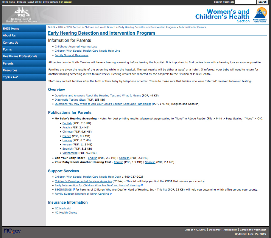
Figure 2.1a
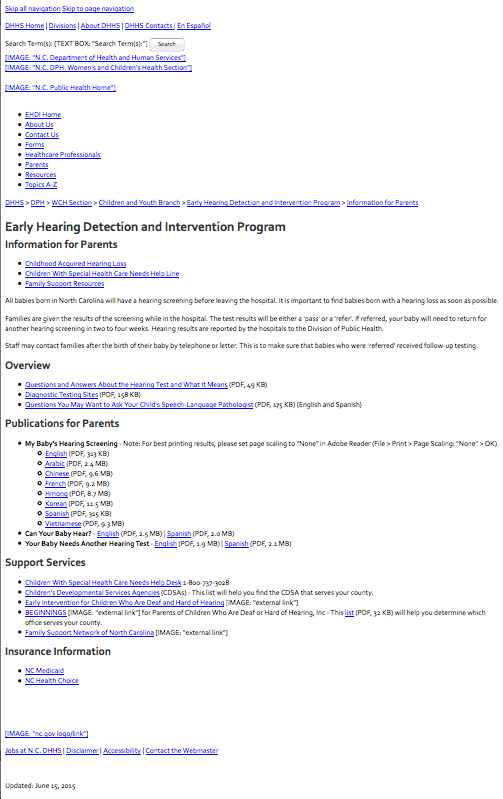
Figure 2.1b
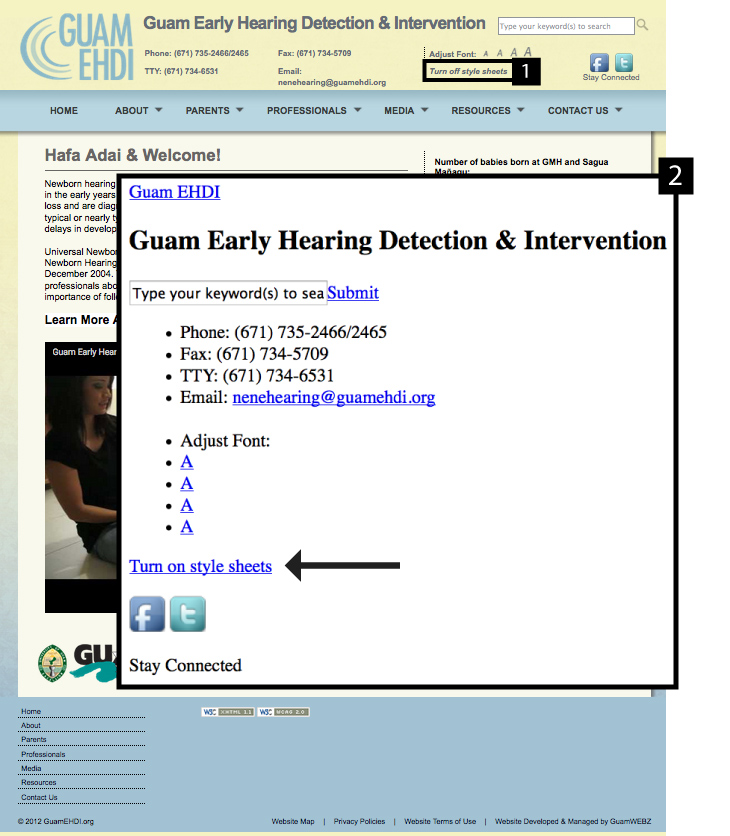
Figure 2.1c
North Carolina’s website meets the following critical components:
Webpage is organized so it can be read without the use of style sheets
- Fig. 2.1a shows North Carolina’s “Information for Parents” page when styles are enabled. The prime space is used to display that their program is part of the NC department of Health and Human Services in the Women’s’ and Children’s Health section. Directly below that is a breadcrumb trail navigation and the title of the program using a true heading. The main navigation is a vertical series of links located on the far left side of the page, while content is presented as a single column of information taking up the center and right side of the web page.
- Fig. 2.1b shows the “Information for Parents” page when viewed as a text only page (without the use of style sheets). A screen reader will read the information from top to bottom. Any links are displayed as blue text and will be noted by the screen reader as a link. Images on the webpage are noted with brackets and followed by their alternative text.
Important information comes first with an option to learn more
- North Carolina’s web content is organized with headings that audiences can use to scan and find the information that pertains to them. The Information for Parents (Fig. 2.1a) page includes a brief introduction to the content followed by links to PDFs and other resources under each heading.
- Guam provides a button to turn off Style sheets (Fig 2.1c) on their home page and then provides a link to turn styles back on. See the tech notes above to find out how to turn off style sheets through the browsers.
Webpage True Headings Outline
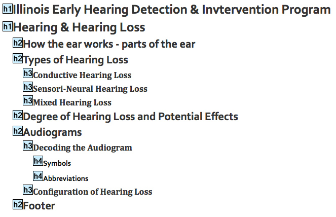
Figure 2.1d
Headings are consistent and correctly coded
Having True headings provides a structure and outline to a webpage, especially if they have a lot of content. With the styles being all the same it is easy to find the section you are looking for. Illinois EHDI website uses up to four levels of headings to organize their information. Fig 2.1d shows the true headings on the Hearing and Hearing Loss page and the level they are coded at.
- Heading 1: Hearing & Hearing Loss
- Heading 2: How the ear works - parts of the ear
- Heading 2: Types of Hearing Loss
- Heading 3: Conductive Hearing Loss
- Heading 3: Sensory-Neural Hearing Loss
- Heading 3: Mixed Hearing Loss
- Heading 2: Degree of Hearing Loss and Potential Effects
- Heading 2: Audiograms
- Heading 3: Decoding the Audiogram
- Heading 4: Symbols
- Heading 4: Abbreviations
- Heading 3: Configuration of Hearing Loss
- Heading 3: Decoding the Audiogram
Style of presentation
Tech Notes: Testing Color Contrast
To test color contrast of a webpage, print a black and white version and see if the text is easily readable from the background. When content uses or relies on color alone, users who have difficulty perceiving color will have difficult time gathering information.
A site that is well maintained, organized, and user friendly will encourage audiences to continue to use and rely on your information. When the page design, layout of content, colors, navigation, font of text, and feel for each page is consistent, viewers can focus on the content. To emphasize the identity of a State’s EHDI program, select a style that can be used for other products as well - newsletters, letterhead, other presentations, etc. This brand identity helps users to recognize an organization.
Color is a key aspect to consider when choosing a style of presentation. Color is important to the design of web content, enhancing its aesthetic appeal, usability, and accessibility. There needs to be sufficient color contrast between text and background. Use light colored text on a dark colored background and vice versa for dark text.
Web pages shall be designed so that all information conveyed with color is also available without color, for example from context or markup.
This standard means that information conveyed by color differences is also available in the text or is provided with other visual cues. For example, someone may not find useful “click red box for more info” if they are color blind.
It is important that the content has a consistent “style” for each of its text elements--headings, body text, links, captioning, etc. Each style on the website should be used for a specific purpose. Heading styles are only used for introducing topics and not for body text. Fonts set the tone for a site, from serious to playful. The larger the text size the more visible the content, but text that is too large can appear unattractive and unprofessional. The format and consistency of text styles emphasizes the organization of a website.
Consistent Page Design Example
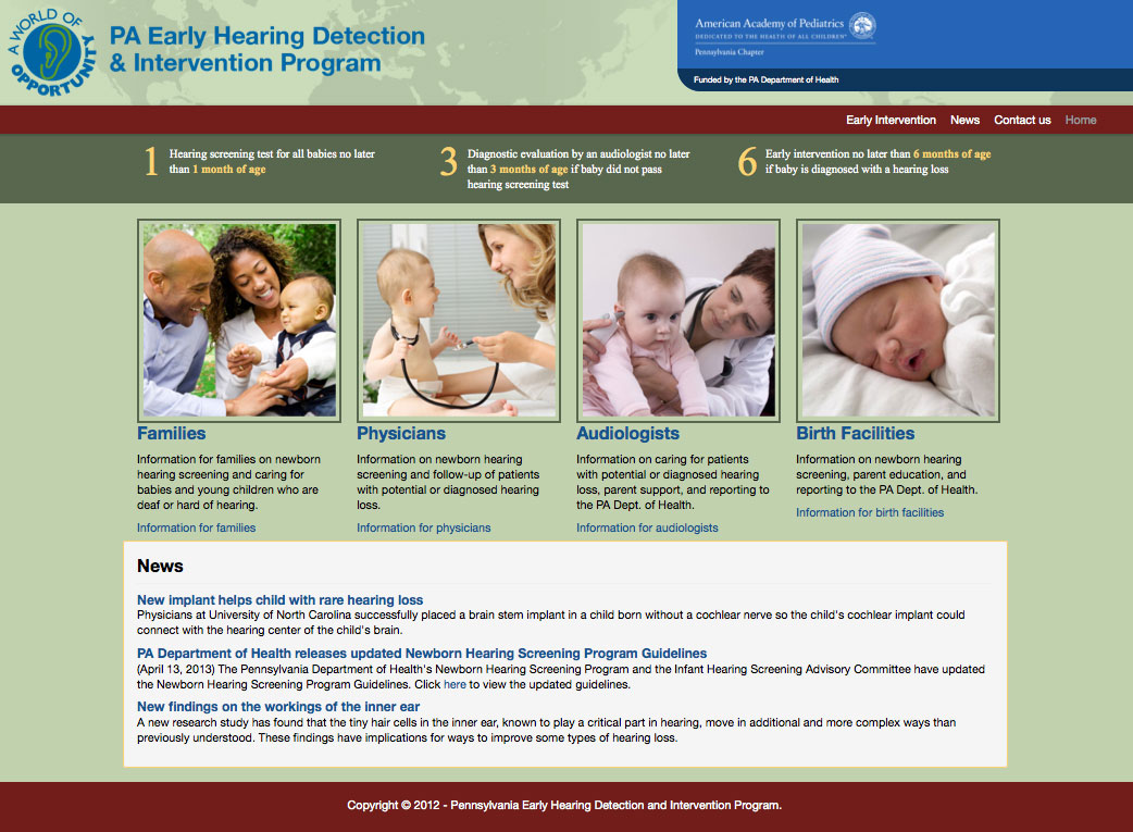
Figure 2.2a

Figure 2.2b
Pennsylvania's EHDI page meets the following critical components for style of presentation.
Page design is consistent
Fig. 2.2a shows Pennsylvania’s homepage which includes similar elements used throughout the website as shown in Fig. 2.2b.
- Navigation links are below the header. In the red line links are located on the right side. In the green line you will find the section heading and the breadcrumb trail for the section for each stakeholder section.
- In general the right side of the content area is used for side boxes that hold interesting information, additional resources, or other useful links.
- Prime space or top left corner displays Pennsylvania’s EHDI program logo and text to identify their program. On the top right they show their partners logo and who they are funded by.
- The layout of the content area is similar across all content pages. It includes the content heading followed by a brief description for each section and has a link to read about more information.
- At the bottom of all the pages is the “1-3-6” information
Contrasting Colors Example
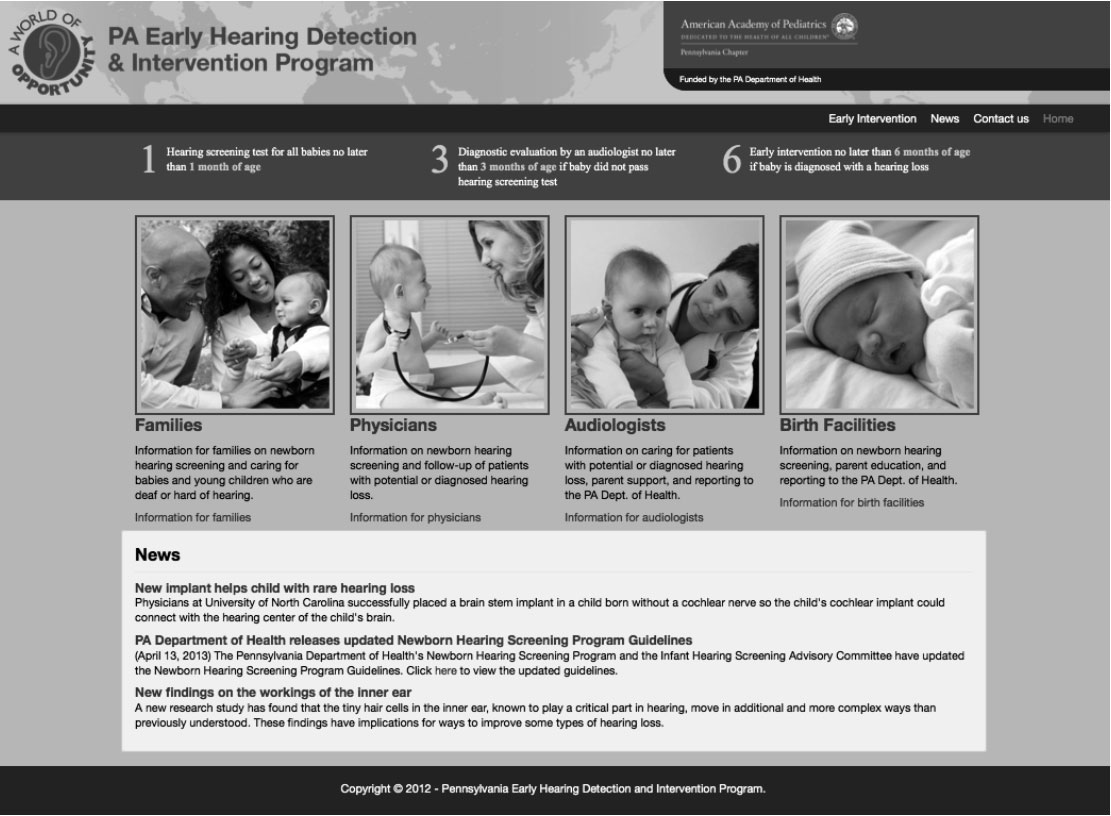
Figure 2.2c
Sufficient color contrast between background and text
- Fig. 2.2c shows how Pennsylvania’s homepage looks without color. The color contrast between the background and text is high enough that information is still legible when viewed.
Text Elements Example
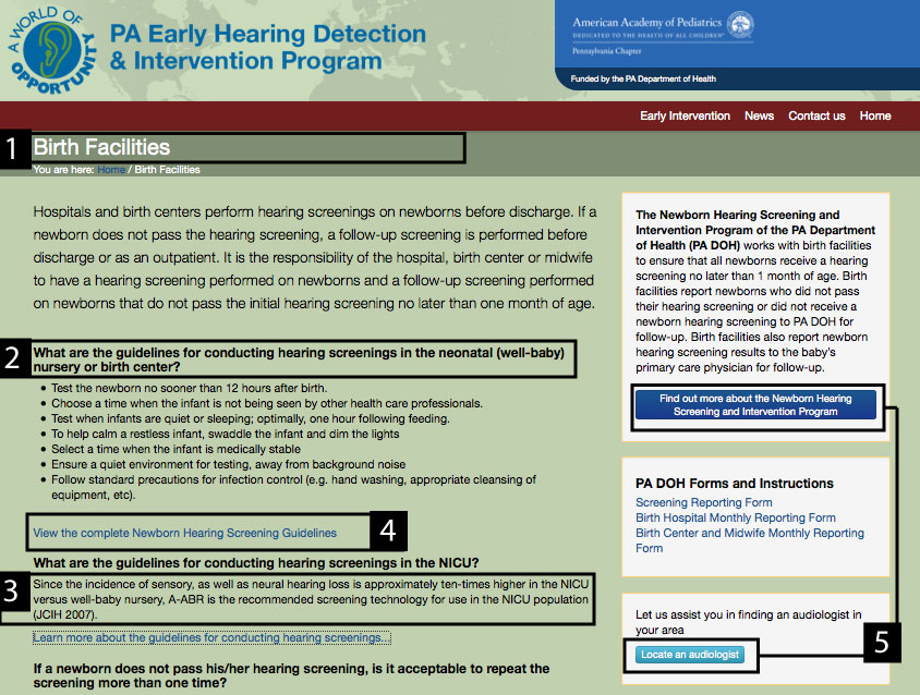
Figure 2.2d
Text is consistent
Fig. 2.2d points out different text elements that are consistent across Pennsylvania’s entire website.
- Page titles are large white text located near the top left of the page.
- Headings use a larger font size than normal text and are bolded for emphasis.
- Normal paragraph text.
- Text links are identified by blue text, rather than normal black text which is used for the main content.
- This site has two layouts for clickable buttons that uses white text on a dark or light blue background.
Navigation
Navigation mechanisms—typically the main links provided on your website--are vital components as they allow users to quickly access information on other pages and can be used to organize content. The types of navigation methods used will vary depending on the amount of content on the website. Generally there should be at least two ways available to access pages.
Listed are some common navigation mechanisms:
- Universal navigation bars (primary navigation) are consistent throughout the entire website and are provided on every page. These are typically the links that appear at the top of the page or in a sidebar.
- Local navigation bars (secondary navigation) are a list of links for pages within subsections of the website.
- Breadcrumb trails are used to list pages that you have visited; these help you return to pages that you’ve already been to.
- Site maps tend to be a page that provides an organized list of all page links on your site.
- Table of Contents is used to quickly reference and jump to different sections on a single page.
- Search Function is used to locate pages within a site by using keywords.
Navigation methods should be consistent and located at the same spot on every page. This helps an audience’s efficiency in searching the site. If the EHDI website is on a larger site, e.g., within the health department’s site, it is beneficial to have a link available to return users to the main page of the EHDI site. This allows users to find the beginning of your section if they become lost by clicking on too many links.
Navigation links can become overwhelming and time consuming for audiences that use screen readers. The reader reads all information – including links and content–linearly instead of scanning the site visually to find the content. Also, it can be tedious for keyboard users to tab through all the navigation links to get to the main content. Every time a screen-reader user visits a new page, the screen reader begins reading from the top of the page down, and all the navigation links are repeated.
A method shall be provided that permits users to skip repetitive navigation links.
Providing a link at the top of a page that allows users to skip navigation links and go straight to the main content speeds up the reading process for screen reader and keyboard users. Many websites hide this link from the visual design of a page, but the link can be seen when styles are disabled. The link should appear near the top of the page and usually reads “skip navigation,” “go to main content,” or something similar.
Stand Alone EHDI Website Navigation
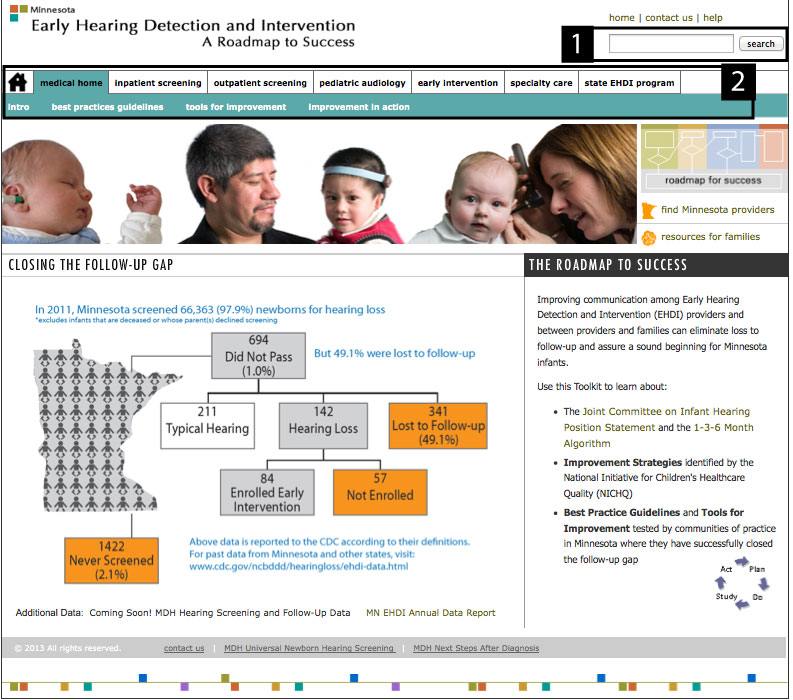
Figure 2.3a
Minnesota’s EHDI website meets the following critical criteria for navigation.
Provides several methods to locate a web page
Fig. 2.3a shows the different methods of navigation.
- Search bar is at the top right corner of the page.
- Universal navigation spans the width of the page underneath the banner. As you scroll over each section a local navigation/ drop down menu appears with a specific color that coordinates with the pages.
EHDI Website as part of a Health Department Website
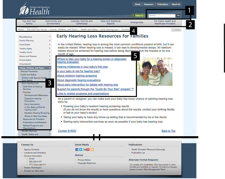
Figure 2.3b
Washington’s Early Hearing-loss Detection, Diagnosis and Intervention (EHDDI) Program web information can be found within their State Department of Health website. The following elements meet the critical criteria to navigate a site (fig. 2.3b).
Provides several methods to locate a web page:
- Search bar is at the top right corner of the page.
- Universal Navigation for the Health Department is at the top of the page and provides drop down menus for specific areas when your mouse hovers over the words.
- The Local Navigation bar is on the left side of all pages and uses a different color to highlight the specific pages for the section you viewing.
- Breadcrumb trail is located at the top of the content area (under the universal navigation) and is used to show progression through a website. Audience can use this navigation to return to the first page of WA’s EHDI website.
- Table of Contents are used on the index pages providing a list of subpages viewers can use to link to more specific information.
Accessibility to Skip Navigation

Figure 2.3c
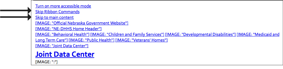
Figure 2.3d
Figure 2.3e
Skip navigation links are generally shown at the top of the webpage when all styles have been disabled. This makes it convenient for people who use screen readers to bypass the same repetitive links. The images show how different states allow users to skip links to get to the content.
- Figure 2.3c: Vermont uses a Skip Navigation link takes the user to straight to the content.
- Figure 2.3d Nebraska uses a Skip Ribbon Command link which allows the user to skip links in the header section. They also have a Skip to main content link which takes the user to straight to the content.
- Figure 2.3e Texas provides 4 skip options which take you to different areas of the webpage: Skip to global menu, Skip to local menu, Skip to content, and Skip to footer.
Visual Media
Many concepts are communicated more effectively with the addition of illustrations, graphics, videos, and photos. They can be used to convey important information or provide visual enhancement on a site. Choose visual media that shows racial and cultural diversity of children, families, and healthcare providers to reflect an inclusive EHDI program. There are many resources that can be used to obtain visual media. You might consider hiring professionals to take photos or design graphics, or finding your own media on the web. You should also ensure that you make all visual and audio media accessible to everyone.
The following section deals with accessibility of visual media.
Images & Graphics
The largest accessibility issue on the web is the lack of alternative text for graphics and images, which allow assistive devices to identify what the image is. Whether you are using an image for aesthetics, showing a process, or as a link to other areas of the site, it is critical to make the image accessible.
A text equivalent for every non-text element shall be provided (e.g., via "alt", "longdesc", or in element content).
Without alternative text, the meaning of an image cannot be ascertained by people who use screen readers or have other disabilities. Alt text should communicate the purpose of the graphic and not just its appearance. It is important to note that screen readers cannot read text that is part of an image. If the text is information that is needed by the viewer is must be available in the alt text.
Tech Notes: Checking Alt Text
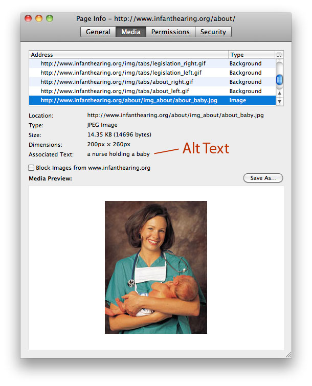
Figure 2.4a
All images/ graphics should be tested for alternative text. Depending on your computer and its setting the following methods may vary. Using the Firefox browser right click an image and select “view image info.” If there is alternative text available it will be next to the associated text marker. Macs and Internet Explorer show the alternative text when you hover over the image with your mouse. If there is no alternative text appropriate text should be provided. Many Content Management Systems (CMS) have the option to add alt text in the menu where you add or format your images. If the website is hand coded, contact the webmaster to implement the alt-text code in the image tag.
Methods to verify alternative text will vary based on browser and computer settings. Some browsers will display the alt text (if available) when the mouse is hovering over the image. Using the Firefox browser: Select an image by right clicking on the image → select view Image Info from menu → If the image has alt text, it is described under associated text (Fig 2.4a).
Finding Appropriate Images and Graphics
Finding appropriate images and graphics can be a challenge. To obtain quality photos, images, and graphics for use on your website you can:
- Hire a photographer to take pictures of the EHDI process. Don’t forget to obtain permission from individuals before using their pictures.
- Purchase stock media (photos, videos, illustrations, etc.,) that is available on the web. One of the larger providers of stock images is IStockPhoto.
- Talk with your partners to find out if they have any visual media that could be used.
To create an individual style for the State’s EHDI program, hire a designer to build a look/style to represent your organization.
Using Visual Aids
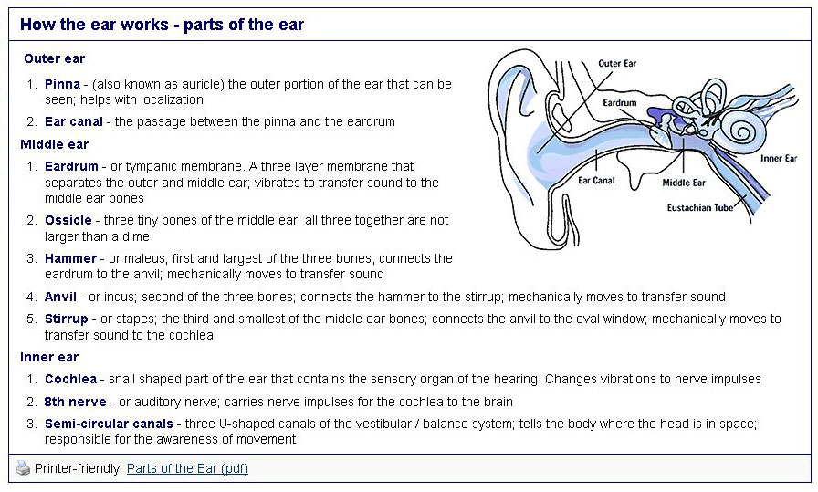
Figure 2.4b
Illinois' website uses graphics and descriptions to explain hearing & hearing loss and to provide information about Hearing Aids. Fig 2.4b shows a diagram of the ear showing outer ear, ear canal, eardrum, middle ear, eustachian tube, and inner ear with a text description of the parts of the ear. This content is used to explain how the ear works. Other visual aids used on the site include samples of audiograms to explain types of hearing loss and images that label parts of a hearing aid. To help people remember the size of battery needed for a hearing aid they colored the text* based off of the manufactures stickers on the packaging.
- Size 10 - yellow
- Size 312 - brown
- Size 13 - orange
- Size 675 - blue
*For accessibility the color is stated along with the colored text.
Videos & Audio
Video or audio files are creative ways to explain processes, difficult concepts, or show action. Whether you use video or audio files, they should support EHDI’s mission and be accessible to all users.
Equivalent alternatives for any multimedia presentation shall be synchronized with the presentation.
This standard means that captions (equivalent text for the spoken word) appear at the same time the audio is available for any video or audio recording. It is intended primarily for those who cannot hear the audio, but it has also been found to help those that can hear audio content and those who are not fluent in the language in which the audio is presented. When possible provide the audio or captions in multiple languages. For people with a visual disability, audio or text descriptions provide additional information about what is visible on the screen.
Tech Notes: Video Captioning
When you receive videos for your site, ask for a version with captioning and descriptive text files. Many companies can provide both. You can also add synchronized captions yourself using one of the many captioning tools available. If you use a tool that automatically captions your videos, remember to check that the captioning is correct. These tools have speech recognition software that can help but is not always correct because of an individual’s dialect and pronunciation of words is difficult for the software to interpret. In the end you could have nonsensical information rather than what is being said.
WebAIM, experienced in accessible web design, provides some useful articles on how to add captions to media files.
Use of Captioning and descriptive text transcripts for audio and video

Figure 2.4c
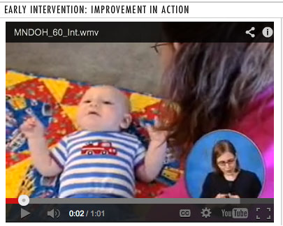
Figure 2.4d

Figure 2.4e
North Dakota’s EHDI website provides a video, Giving your Baby a Sound Beginning, produced by NCHAM, in both an English and Spanish version with closed captioning (Fig 2.4c and Fig 2.4d)
Minnesota has a sign language interpreter to sign what is being said in the video in the bottom right corner of the video (Fig 2.4d).
Virginia created their own introductory video (Fig 2.4e) for newborn hearing screening. The video is captioned and available on their site and on YouTube.
Browser Compatibility
EHDI administrators and web developers should be familiar with different web browsers. Using a statistics tracking program such as Google Analytics allows you to determine what browsers people use to view your site. Discuss implementing an analytics program with your sites web developer so you can view the statistical information. W3Schools offers month to month statistics and trends information for a variety of browsers.
The most commonly used web browsers include:
- Internet Explorer 7, 8, 9, 10: the default browser for Window users
- Firefox: an Open-source browser available for Mac and Windows
- Safari: the default browser for Mac users, but also available for Windows
- Google Chrome: an open-source browser available for Mac and Windows
- Opera: a web-standard-compliant browser and used for many mobile platforms (i.e. smart phones and tablets)
Tech Notes: Browser Compatibility
Each browser has its own set of rules for displaying websites. It is critical to verify that your web pages function as expected in different browsers. This is done by opening the website in a different browser and verifying that all the functions work. Sometimes layout can break or videos won’t function. Web browsers do not always keep up with new web development technologies.
With emerging mobile technology, viewers are using their smart phones, tablets, and other mobile devices to view websites. It is important to discuss strategies for creating your State’s EHDI webpage to be viewed by mobile devices with your web technician. There are many considerations beyond the scope of this guide that should be considered.
Download the most common web browsers:
Tools to check browser compatibility (NCHAM does not endorse any of these tools).